What came first, the page or the scroll? How about online? In Perpetual Dizziness, Sonia Almeida extends skeuomorphism into the manuscripts of the Late Medieval period. Skeuomorphs are designs imitating older technologies, often in the graphic depictions of physical objects: early pottery textured to resemble woven baskets, for example, or electric candles, or the mechanical, shutterlike ‘click’ of phone cameras. Previous paintings by the artist, from 2013–14, played with skeuomorphic symbols like play, pause and fast-forward – which refer to the direction and speed of tape in a reel-to-reel tape deck, and the caesura of poetry and music in the case of ‘pause’ – as well as colour systems like RGB and CMYK.
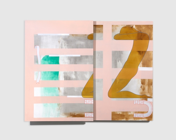
This suite of new oil paintings on plywood, aluminium and paper also takes inspiration from publication design old and new, from illuminated manuscripts to book and web pages. But here the skeuomorphism has been inverted, and a number of two-panel works boast slider mechanisms that can be manipulated by the viewer to reveal or conceal the lower panel. Depending on the panels’ position relative to each other, the result alternately suggests a double-page spread or the features we associate with much newer technologies like time-based media (animated gifs) and web design (parallax scrolling).
Almeida’s imagery, meanwhile, remains decidedly medieval. Particularly attractive are the occasional manuscript ribbons, whose sinuous ripples are echoed in various silhouetted figures. Women, the press release says, but there’s a lovely, lithe androgyny to them. Their bodies are contorted into letterlike shapes, in the manner of anthropomorphic alphabets. The glyphs are indicated by the paintings’ titles and include a variety of cases. In Magnetism / Upper case Z (all works 2018), a figure kneels as if in prayer, but its torso is canted to form the letter’s diagonal stroke. In Muscle memory / Lower case h, meanwhile, the form balances on an elbow and knee, reaching one elongated arm upwards. Painlessly, though, as that title suggests: the figures seem to relax into the positions with the ease of well-honed muscle memory. If skeuomorphs are predicated on aesthetic familiarity, these figures suggest flesh and sinew. And there’s a nod to even earlier forms of inscription too, with a recurring brick motif suggesting the proverbial writing on the wall.
The hybridised palette is decidedly more contemporary, a brilliant mix of savoury, vegetal tones that wouldn’t have looked out of place on an altarpiece, and bright, sherbetty pastels. The latter, along with flat outlined shapes, gives the whole affair an art deco feel. But of course, because this is 2019, I see flat design 2.0, particularly in the unsubtle drop shadows of Face Formation. And just like flat design, these paintings depict illusionistic 3D space in an abstracted form. Similarly, the occasional palimpsestic gesture – translucent figures, gradiented washes of colour – reminds me of nothing so much as Photoshop’s opacity filters and the dizzying array of options its own sliders provide. What can I say? I was raised on the Internet too.
Sonia Almeida: Perpetual Dizziness at Simone Subal Gallery, New York, 6 January – 10 February
From the March 2019 issue of ArtReview
