Maccarone, New York, 2 May – 28 July
There are groups of dumpy, paint-stained black couches scattered throughout Mark Flood’s latest exhibition. They look like they came from the furniture store Rooms To Go, or even more tragically, a Goodwill in New Haven, Connecticut. They’re actually from the artist’s studio in Houston, TX, and they’re a tad slutty, since they ‘get around’ to so many of the artist’s shows. Here, they’re placed over equally downtrodden carpets, and face Flood’s paintings. This is notable because they’re such analogue foils to Flood’s canvases, which depict ethereal streams of brand logos and Twitter feeds – the pleasures, and terrors, of the placeless, neoliberal digital age. Take a well-used seat, Flood seemingly intones, and contemplate the shiny, slick things that will never age, but remain the same for all time, like fossils made of zeros and ones.
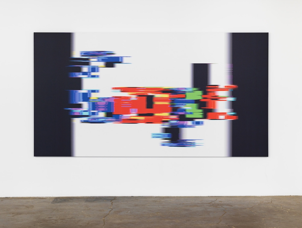
Movement is a big part of the work: all of Flood’s logos are printed blurry, as if they were animals triggering motion-detection cameras at night. Starting things off with a bang is the massive Deutsche Bank logo in Captured Serpent (2017), which simply floats – or rather, slowly drags – over a sea of white space. Logos are weird. They could be anything. This one could conceivably be a road sign in another country, or a framed slash mark on your keyboard, or the ‘tribal’ tattoo on your butt cheek. Even though it’s an empty signifier, arbitrarily given meaning by one of the world’s largest financial conglomerates, when printed on a five-metre-wide canvas, it’s sublime.
Then there are the Google logos performing ‘lines of escape’, Gilles Deleuze’s description of capital wiggling its way out of tricky situations. Google Murder Suicide (2017) appears like it was caught moving 15cm to the right; Google Transformer CGI (2017) looks like bits of it are being flayed away in chunks; and Google Blur (2017) is hightailing it every which way, as if it’s being both flattened and stretched out at high speed. You can barely make out the company’s letters, they’re so washy and spread thin.
Much stranger are the paintings composed of acrylic paint, stencilled with the frilliest of lace. In Paddock (2015), the lace is painted Pepto-Bismol pink and edges a sea of primary green. In The Women’s Cult (2017), it’s similarly pink and also yellow, and even contains ancient Dionysian nymphs trotting around it, blithely carefree. Don’t they realise they’re in for it? That the body is passé? The look of both paintings is a combination of tacky Grandma craft-time meets imperfect monochrome. They’re hideous, but in a so-hideous-it’s-chic kind of way.
Rounding things out are paintings of Twitter feeds – Don’t Be Stupid (2017), for example, which layers conspiracy threads about Julian Assange’s death – and stencilled, graffitilike cardboard works that spell out Serve the Community Bitter and Death/Safe Space (both 2016). These are by far the least interesting works, if only because they seem so straightforward, even banal.
But wait, there’s more – a Greta Garbo wall isn’t easily forgotten. Pages from a found scrapbook that some Garbo-obsessed teenager (or psychopath, it’s not clear which) made in 1939 are hung here in a grid, arranged roughly chronologically. The work seems out of place, but actually isn’t. Garbo was, in her own way, a kind of logo too, or at least a mega brand from a pre-Internet era, if one can even fathom that. It’s a nifty reminder that while technologies change, branding has always remained the same moving target.
