At Gucci’s second exhibition at its flagship New Bond Street store in London, textures and materials are placed in dialogue via the work of established and early-career artists
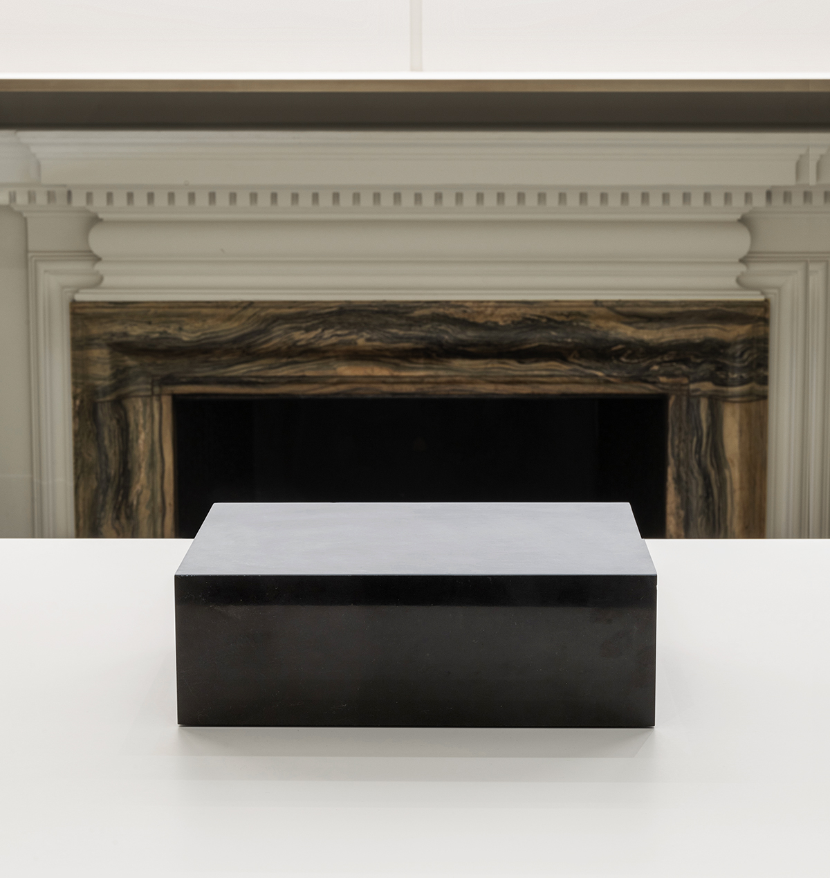
Begin with Ettore Spalletti’s Base Colore (1991): a thin layer of greyish-blue plaster coats the surface of a perfectly cut cuboid of Belgian black marble – a material favoured among artisans since Antiquity for its deep, glossy black polish. The plaster looks as though it could be scratched at or eroded; just a few millimetres of delicate skin that contrasts with the austere, sharply edged block of marble beneath, which is, by the very nature of its material, impermeable. A metamorphic rock that has reached its final, unchanging state. And yet, as visitors move around the sculpture and its calm, muted colour palette, the tones of the plaster and stone appear to change subtly, imbued by light and shadow, drawing attention to the work’s ephemeral qualities.
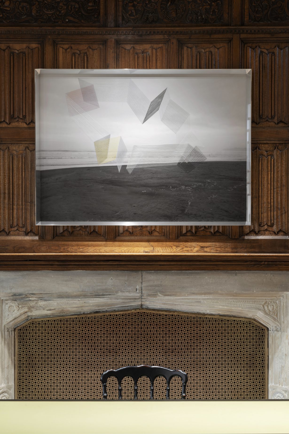
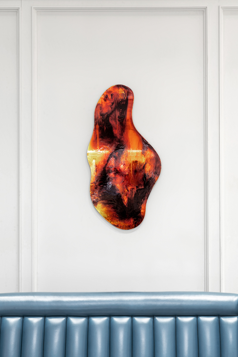
It’s in this constant state of betweenness that visitors of Gucci’s 18-artist presentation might find themselves when looking at the works in Gucci’s flagship New Bond Street store in London. (This exhibition, which features a selection of works selected by Gucci’s Creative Director Sabato De Sarno and curated by Truls Blaasmo, marks the second year of the Gucci Art Program, which aims to put materials and textures in dialogue via the work of established and early-career artists.) That feeling of uncertainty may be because the materials of a work are not, at first, immediately recognisable: Stuart Arends’s Slating 12 (1990) is a wooden box veneered with thin plates of slate (also a metamorphic stone) that are painted over with black and bright green stripes. It may also be because the work is suggestive of both physical boundaries and liminal spaces: Heavenly Sounds – Pink & Yellow (2017) by Maurizio Anzeri, is a photograph of a shoreline, onto which the artist has embroidered what looks like the faint walls of a floating, haphazardly-shaped room; Flavie Audie’s series of glass Bricks, (2024) takes the form of a ubiquitous building block and renders it transparent. Or because the work might not straightforwardly conform to the medium it’s presented in: LIVING IN YOUR EYES (2019) is a painting of horizontal rainbow colours over which the titular words appear; but it’s not only a painting because Giorno was a poet, too, and so the work sits somewhere between two disciplines, never quite one or the other. And it may even be because the work itself might only be completed by the presence of a viewer: Bokani’s Silence (2021) appears like a pool of molten glass – except that it’s installed on the wall and is actually a mirror coated with stained glass enamel. By approaching the work and standing in front of it, the viewer is engulfed in fiery tones, caught somewhere between death and rebirth.
And then there are the more abstract states of being ‘in between’ that occur both within the artwork itself and outside (or alongside) it. For Franco Mazzucchelli, that’s expressed in multiple ways: he calls himself a painter but he’s best known for his public inflatable sculptures that he’s been making since 1964. He first experimented with what would later become the wall-based series Bieca Decorazione, which the artist translates as “only decoration”, in 1971, when he installed flattened versions of his inflatables across the walls of Milan’s Spazio Anny Di Gennaro. Mazzucchelli returned to making the Bieca Decorazione in the 1990s as a rebuttal of what he saw as the increasingly commercialised focus of the artworld.
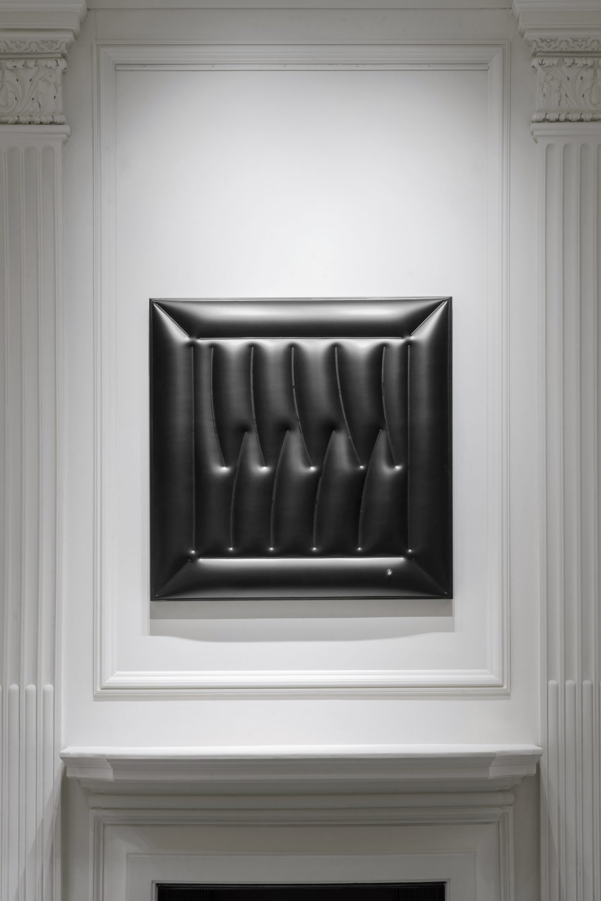
In order to navigate this and still participate in the art market (he wasn’t about to look a gift horse in the mouth), Mazzucchelli says he decided to “game the system” by creating Bieca Decorazione – works that look as though they’re industrially manufactured, but which are all handmade from reams of PVC laid on top of wooden panels and moulded around pockets of air. Indeed, he has dabbled in making ‘editions’ of Bieca Decorazione to poke fun at the value systems imposed on artwork by galleries and collectors: “What they didn’t know was that these ‘editions’ were actually all unique – they had the same pattern, but each one was made from scratch.” The ‘game’, then, being that in labelling these wall-works as ‘editions’, Mazzucchelli knowingly drove down the value of his own artwork – an ironic take on the art market that’s also reflected in the series’ self-deprecating title. And he puts it best when he describes, “when a work of art is sold and it’s transferred to the home of a collector, the original meaning is lost.” Because not all ideas can be contained or controlled.
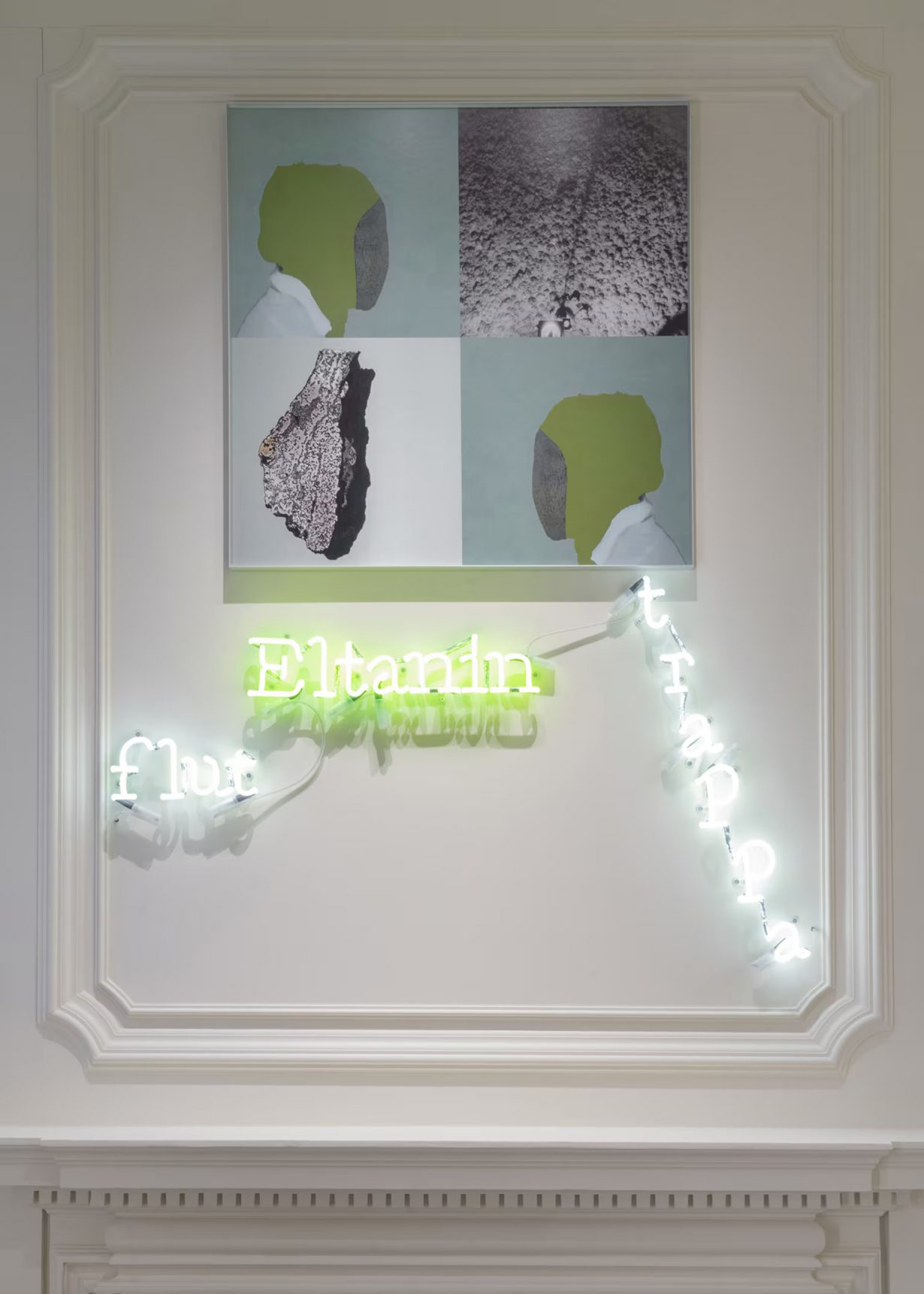
In translation, for example, which is central to Jamilah Sabur’s mixed-media An antipode, a stairway, a spectral standard from Arabic At-Tinnin (2023) the nuances of meaning occur in the spaces between words. In this wall-based work, the neon words ‘Eltanin’, ‘trappa’ and ‘flut’ are installed beneath a square inkjet print whose four quarters depict rock textures and what appears to be semi-abstract profile portraits of humans with smooth, stone faces. The words form an aggregate of cultural and linguistic layers that transcend straightforward translation. “‘Eltanin’ refers to a basalt rock from the Siberian Traps photographed by the research vessel Eltanin in the 1960s – and the vessel was named after a star in the constellation Draco, which in turn comes from the Arabic At-Tinnin, meaning ‘the great serpent’,” says Sabur. Here, the word ‘Eltanin’ connects the celestial and terrestrial realms. The German ‘flut’ (flood) alludes to flood basalts (formed from volcanic eruptions), while the Swedish ‘trappa’ (stairway) refers to the etymological roots of trap rock. An antipode… tracks the journey of words across languages and scientific paradigms, revealing how meanings evolve and transform. “The relationship between the images and words in this artwork is deliberately liminal and evocative,” says Sabur. “Each word, displayed in neon, serves as a beacon that guides the viewer to its associated image, creating a dialogue between text and visual representation. Translation inherently involves a shift in meaning, where certain nuances and cultural contexts may be lost or transformed.”
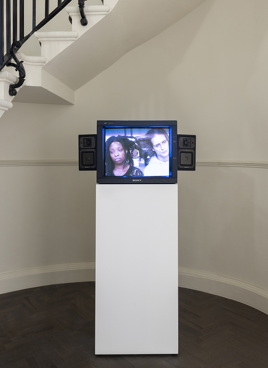
If sitting within this nebulous, abstract space of the ‘in between’ starts to feel uncomfortable, then Sonia Boyce’s video documentation of her 2005 performance Exquisite Tension – in which artist Richard Hancock and curator Adelaide Bannerman are joined as their hair is woven together by the artist’s hands – brings visitors firmly back into the corporeal realm in its tense exploration of the interplay of individuality and unity. Boyce first performed Exquisite Tension with Hancock during a residency in 2005; asked to pair with another artist and come up with an ‘action’ that highlighted differences between them, Boyce decided to plait her black hair with Hancock’s blonde. “I remember the feeling of being pulled, and trying to adjust our movements to each other because of our differences in height,” says the artist. “But it was also this feeling of being connected by something that was slightly uncomfortable. And at the same time I was trying to be very aware of Richard – I’m much shorter than him so I was trying to move in as generous a way as possible so that he didn’t have to bend down all the time. And I think he was very aware of how his position might have been affecting me, too.” Through a series of choreographed movements and interactions, Exquisite Tension highlights how two distinct individuals might physically and mentally coexist in harmony. What at first begins as an awkward binding together of two people gradually unfolds as both Hancock and Bannerman become accustomed to one another – the broader message revealing the delicate balance between maintaining personal identity, while forming a collective understanding and shared experience. Boyce’s work captures something of the essence of human relationships, emphasising that through tension and collaboration, connections can be forged through which new meanings come into being.
The exhibition will be running until September 2024 and open to the public.
Gucci
144-146, New Bond St, London W1S 2PF
Gucci Art Program: Beginnings
Gucci Art Program finds its genesis in 1977 when Aldo Gucci founded Gucci Gallerias at the Beverly Hills Boutique – a private exhibition model that was later brought to Gucci’s Fifth Avenue store in New York in 1980. The concept was to create an environment for select clients in which they could experience art alongside fashion, blending the creative practices of visual art and couture – and accessed only by a crystal elevator and a leather-wrapped brass key.