
The text-based paintings of the American artist divide words into their visual and literal meanings
1.
Someone once said to Glenn Ligon: “Surely the binaries of race in America are embodied by the black and white in your art.” “I thought it was really funny,” Ligon says, recalling that moment, during an August interview in his Brooklyn studio. “So, in order to make him see how silly his statement was,” he continues, “I asked him if, since newspapers are basically black text printed on white paper, all newspapers represent the binaries of race in the United States.”
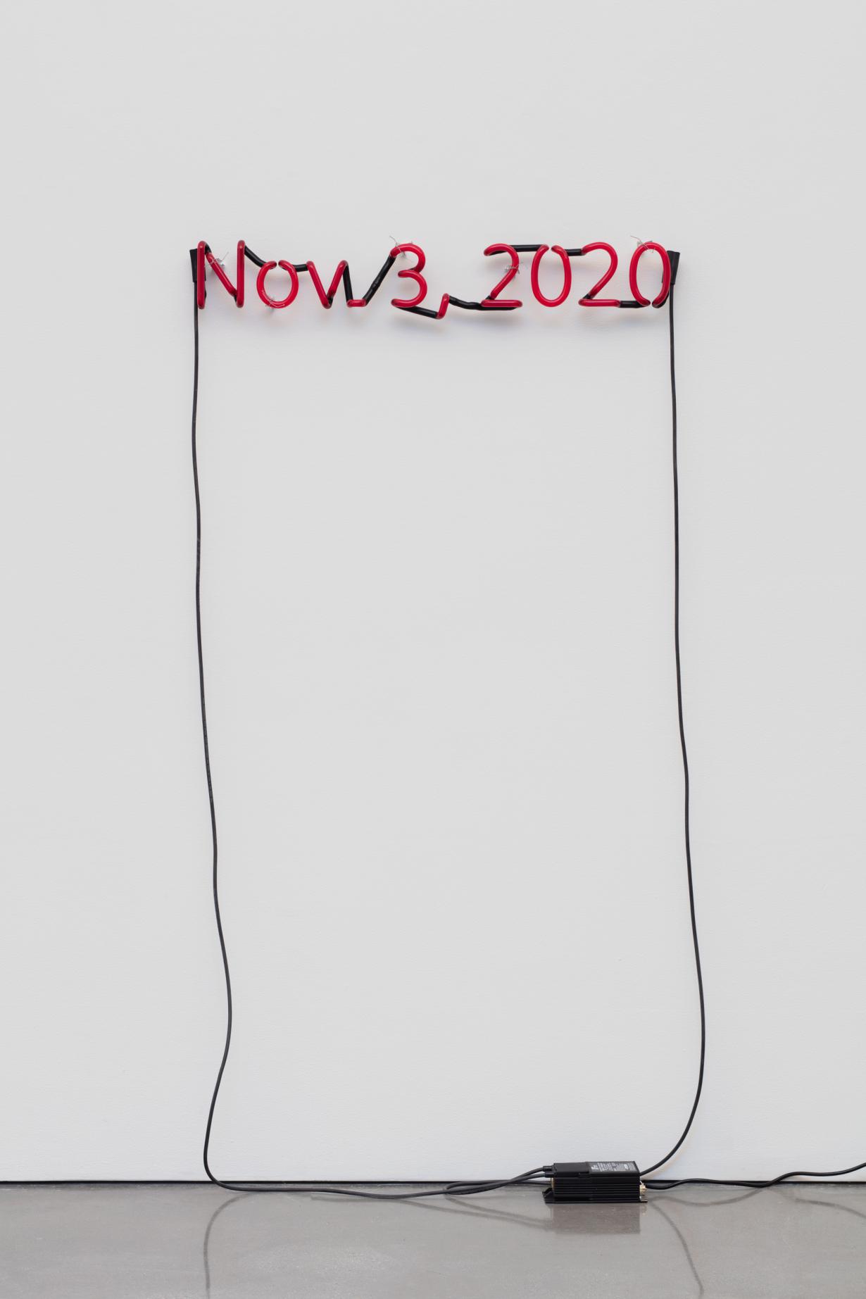
It’s an irritating thing to be constantly put in a box, but because of the very overt politics present in Ligon’s art, it is easy to see why viewers and critics of his art run the risk of reducing everything he makes to issues of race, sexuality, identity and other social issues. Despite the fact that, at sixty-one years old, he has worked as an abstract painter, produced sculptures with neon lights and made images that are manipulations of photographs, his tradition of working with text in his peculiar way has become his representative style, and like those of most great artists, it is easy to recognise. Indeed, there is probably no artist alive today employing text with such a simultaneous focus on both its formal and political value.
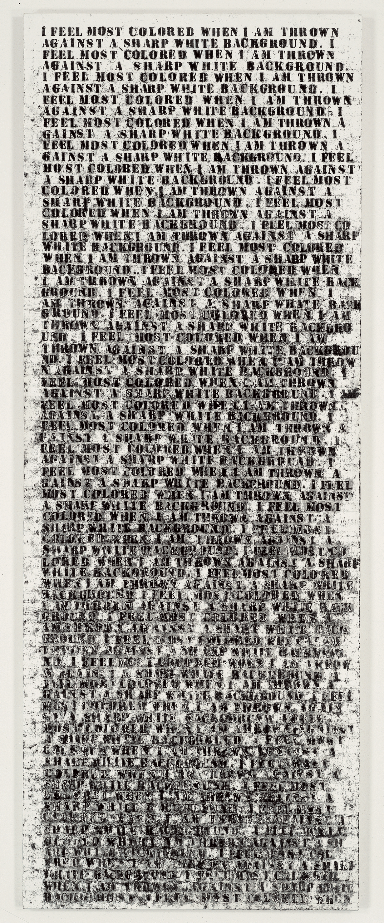
In general terms, any relationship between image and text is tenuous, a matter that has been the subject of an enormous amount of literature. But in Ligon’s work there is the fascinating possibility of a new conversation on transliteration – a corresponding representation of associating each letter inscribed on the canvas to an image: here, literally, it is the text itself that becomes the painting. Ligon’s work with text consists mostly of daubed words or sentences from Black authors (among them James Baldwin, from his 1953 essay ‘Stranger in the Village’, and Toni Morrison, in excerpts from her novels). When the letters that constitute that text get onto his canvas, they smear and roll and twirl, and as a result sometimes become illegible. It is as though the heart of the text itself was squeezed onto the canvas, leaving a distorted husk and the splatter of blood. There is no translation happening – the text changes in visual not literal meaning, and the success of his art lies in how he creates the corresponding association every letter is supposed to evoke when perceived as an image. Sometimes a dismembering is necessary for this association to be accurately expressed. This meta-disfiguration of words transported from the pages of a book to the site of an artwork is, it appears, Ligon’s greatest contribution to the tradition of painting.
2.
Ligon was born in 1960, in the Bronx, New York. He studied together with his brother at a now-defunct private school on the Upper West Side of Manhattan via a scholarship and received an art degree from Wesleyan University in 1982. Three years later, after he had worked as a proofreader for a law firm and spent most of his free time painting in the fashion of abstract painters like Willem de Kooning and Jackson Pollock, he got into the Whitney Museum Independent Study Program, where he read much critical theory and began to use words in his paintings. Untitled (I Feel Most Colored When I Am Thrown Against a Sharp White Background) (1990) is perhaps his most famous and oftendiscussed work: made from sticky oil, gesso and graphite on wood, the two-by-one-metre painting contains words from Zora Neale Hurston’s 1928 essay ‘How It Feels to Be Colored Me’. In the painting, the titular sentence is stencilled repeatedly across the canvas. Sometimes the words break haphazardly, but the striking thing is how thick black oil stick smears the white background, sentence dripping over sentence until the image starts to attain the elements of an abstract painting.
Ligon speaks of his period as an abstract painter with an air of the past, but the compositions in his work prove that this training continues to inform much of his work.
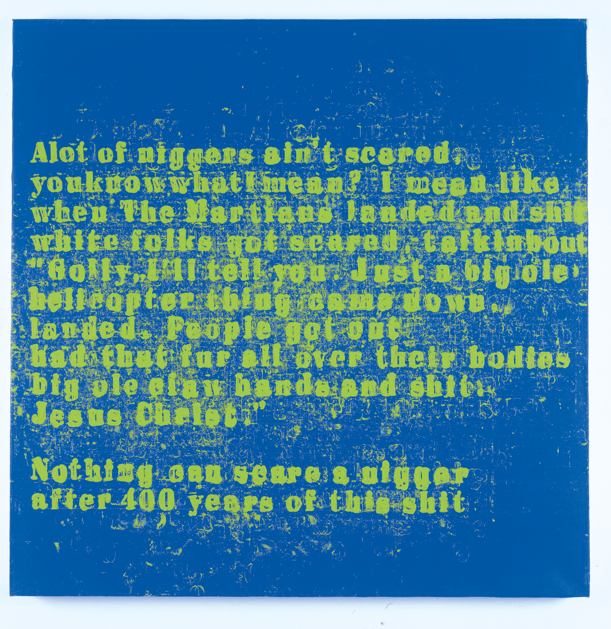
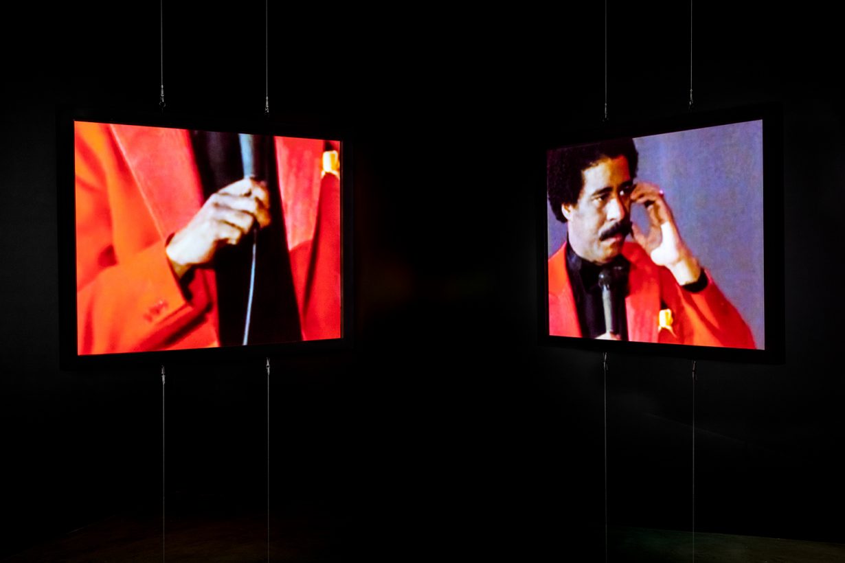
When he started to make paintings like Therapy #2 (2004) based on the acts of figures like the comedian Richard Pryor, Ligon knew that he would require a different formal approach. He had to think carefully about the physical manifestations of the character he was referencing, something he didn’t necessarily have to do with Baldwin or Neale Hurston. Aside from transliteration, there was the need for animation, and colour. It was necessary to include Live (2014, a video installation that was a transformation from Pryor’s 1982 concert film Richard Pryor: Live on the Sunset Strip), although in Ligon’s design sound was absent. He had to correctly depict colours that would appropriately match the energy of Pryor’s flamboyant, flaming dress sense. He used lots of grammatical punctuation, and for the first time his often properly arranged letters seemed to be falling out of line. Was this a precursor for work to come? The letters in his more recent painting series Debris Field (2018), thick, black swabs of disfigured texts on dark red or white canvas, scatter as though in Brownian motion, with an exponential increase in the kind of energy contained in the Pryor paintings. But to manage this energy properly in a composition that works, Ligon says he had to revisit his training as an abstract painter.
3.
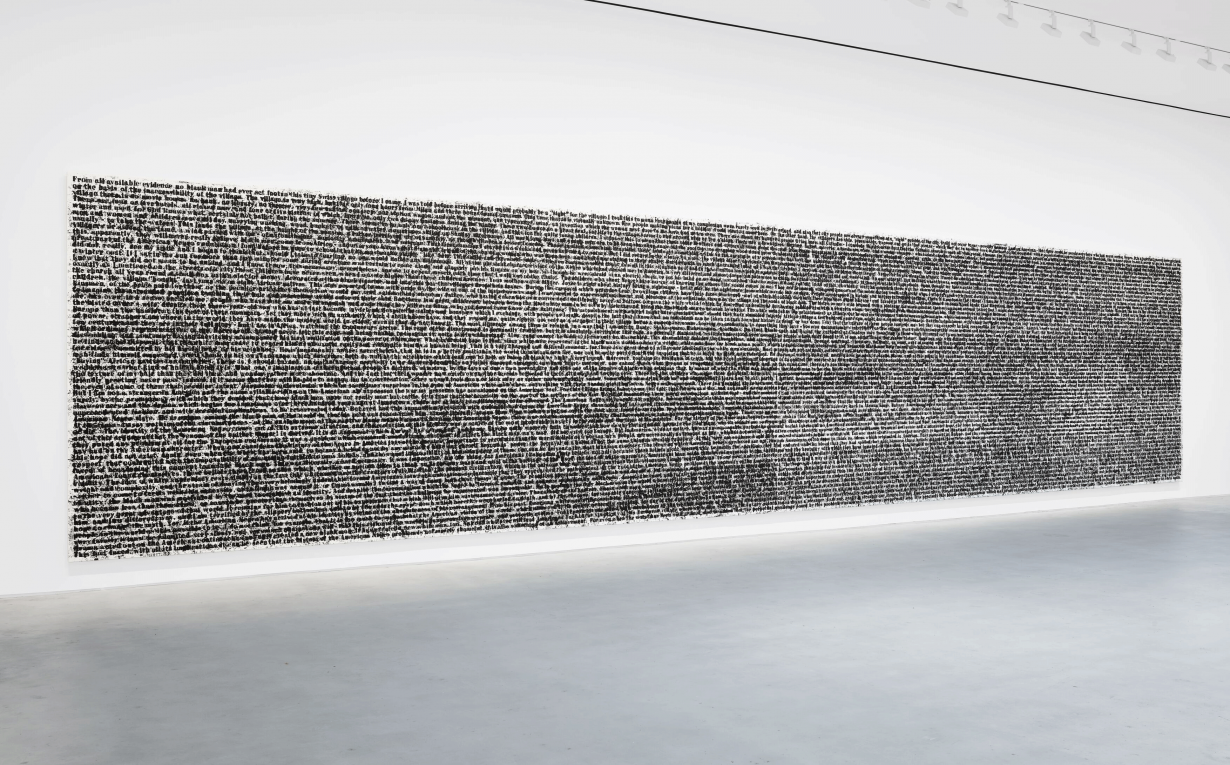
This September, at Hauser & Wirth’s Zürich gallery, Ligon’s new work Stranger (Full Text) #1 (2020–2021) will be on view for the first time. It is the biggest painting he’s ever made – a diptych three by thirteen metres – that renders the entire text of Baldwin’s ‘Stranger in the Village’. The manner is similar to that which he has always deployed: stencilled characters on a white background that drip and pour, as though the words possess a certain viscosity. The major difference here, apart from size, is that Baldwin’s words have covered ground and returned to the geography that inspired them in the first place: Switzerland (where, in 1951, the writer spent a period of time recovering from a near breakdown).
Ligon is known for his letters to famous people like Jean-Michel Basquiat or to his friends. Some of these letters have been published as part of exhibition catalogues Ligon has organised. It is illuminating to think of his relationship with letter writing in parallel to his relationship with text in general. Is every work he produces a letter to someone? “I don’t want to be all mystical,” he says, “but I’ve sometimes imagined these could be letters to some ancestor.”
Letters by nature are intimate moving objects intended to cover ground – from their author’s to their recipient’s hands. Much of the inimitable tenderness in Ligon’s work is explainable when viewed through this lens. But there are extra layers in his case: the fact that many of his pieces contain a great deal of deliberate obfuscation in the way the text is rendered adds an element of intrigue, like the way one feels just before an envelope is opened and the letter is read. Perhaps this intrigue is the point: what is apparent might also contain an inside joke.
Glenn Ligon: First Contact is on view at Hauser & Wirth Zürich through 23 December
From the September 2021 issue of ArtReview