Gillick’s modular show at Kin, Brussels evokes the vocabularies of high modernism – and how they have been since emptied of effect
For over three decades Liam Gillick has honed a modus operandi in which sculptures and installations alluding to rational modernism function as supports for his speculative theses. Fusing together formal registers and cultural references, the UK-born, New York-based artist produces essayistic work with a sociological slant. Research pertaining to often obscure but illuminating microhistories galvanises his extensive output of physical artworks: the phalanx of Plexiglas Screens and Discussion Platforms Gillick has produced since the 1990s, for example, parallels his research into now-defunct approaches to car manufacturing in 1970s Sweden.
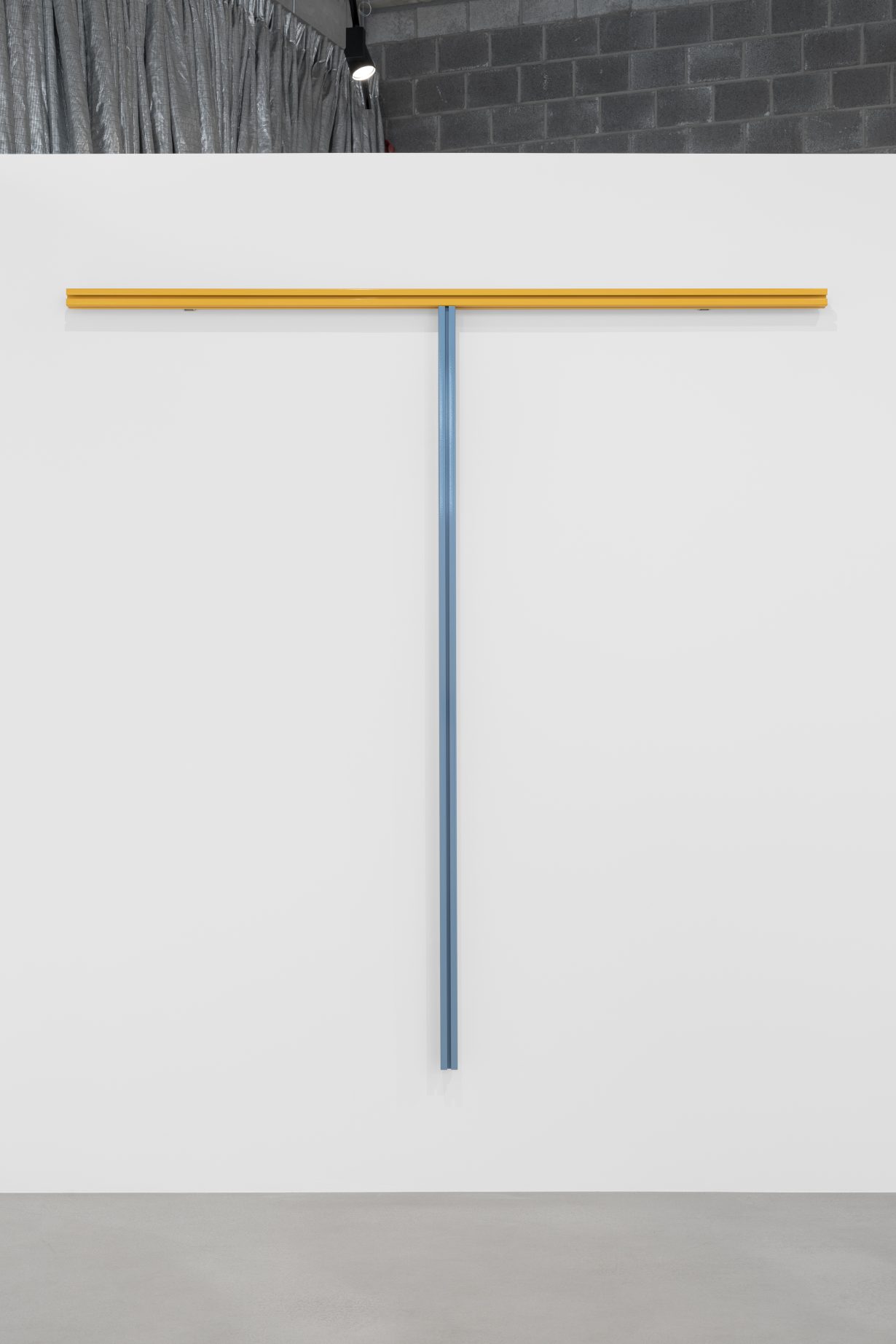
This exhibition, at the recently opened commercial gallery Kin, is suggestive of Gillick’s modular approach; it’s concurrent with a very similar show at Esther Schipper, Berlin, which bears a near-identical title in which ‘Amount Structures’ is left unstruck. The show consists mainly of wall-mounted sculptures and reliefs fabricated from aluminium T-slot extrusions of varying lengths. This ubiquitous and generic modular material, used in retail, manufacturing and data centres, has been customised – most notably via the application of punchy colours in powder coating – to produce a body of work that draws heavily on American Minimalism, both in terms of the formal language and the strategy of elevating lowly hardware. Formed from a spectrum of brightly coloured, snapped-together metal sections, some works are elongated, others squarish, still others linear in a manner that suggests letterforms like Fs and Ns. Art-historical allusions are unavoidable: the horizontal relief entitled Model of a System Type 1 (all works 2024) is notably evocative (particularly in its colours) of Donald Judd’s late works, while Green Analogue Model, backlit by integrated LEDs, calls to mind Dan Flavin.

The colours Gillick uses here derive from the RAL colour standardisation system established in Germany in 1927. RAL is just one of two specific historical methodologies that, according to the press release, sit in the background: the other is the 1920s ISOTYPE pictogram system by Marie and Otto Neurath, whose work fused design and social science. Their designs form the basis for new diagrammatic symbols in thought bubbles, on two framed mockups for book covers: Black Phase of Service and Red Phase of Modeling. In contrast to the original Neurath glyphs, Gillick’s are ludic and arcane. Their placement inside the cartoonish cloud suggests they are in fact subjective; expressive of information that cannot be readily communicated. Both RAL and ISOTYPE are aesthetic systems originally conceived as efficient, universal modes of communication for multiple contexts: industry, architecture, transport, etc. Crucially for Gillick, idealistic impulses lie at their hearts – each was conceived as integral to a mission of worldbuilding spurred on by the messianic zeal for progress that marked the zeitgeist of a century ago. Commercial application mattered, but there was more to them than the privatised, corporatised logic that proliferates in the present.
Gillick’s evocation of the vocabularies of high modernism, then, reveals the extent to which they have been degraded and emptied of affect. This voiding occurred via overexposure, surely, but also because their underlying utopian fervour that once seemed available has been abandoned or nullified. The recourse to repetition, standardisation and detachment that distinguishes this show – and Gillick’s opus in general – mirrors the dominant order of this century. The application of these strategies would be numbing and deadening were they not coupled with the frisson of some ineffable element. What makes the particoloured arrangements on the walls here alluring is the idiosyncratic narratives with which Gillick has infused them.
Fact Structures Amount Structures Language Structures at Kin, Brussels, 1 March – 19 April
