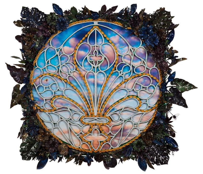
It’s hard to tell if the work in this exhibition is supposed to be hideous or if it’s unintentionally so. The line is thin, if not entirely porous. Many of the works look like they were sourced from a junkshop in southern Florida, or from the halls of some McMansion once filled to the brim with leopard skins, mirrored ceilings and bad taste. This is the point, to a large degree, as Newsome’s meticulous collages play with the attraction of ostentatious materialism. They’re inspired by medieval heraldry and cathedral architecture as seen through the lens of twenty-first-century hip-hop. But Newsome belabours the point, pushing it to such a degree that it triggers one’s gag reflex. I mean, his frames have strips of fake fur attached to them. In Rapture (2013) the frame is clung to by flying cherubs, while in Turn Up (2013) Newsome covers it in leather and gold. Were they commissioned by Cher? It’s like he drove a party bus lined in carpet and Christmas lights uptown and raped the medium of painting with it. While I’m a fan of undermining painterly conventions, Newsome’s attempt is so heavy-handed it hurts.
As if literalising Derridean, postmodernist theory, Newsome makes it hard to even talk about his works without talking about their frames, which are arguably more the work than the work itself. All antique, they have been customised by the artist so as to become a parody of Old Master frames, the kind that wrap around a Titian, say, and manage to be both opulent and restrained all at once. But restrained Newsome’s frames are not. The one surrounding Hey Papi (2011) features three-dimensional plastic Calla lilies poking out from corners knotted with garish green filigree, and long strips of fake fur line its sides. As for the collage itself, it’s composed almost entirely of diamond imagery found in magazines, painstakingly cut out and arranged into a repeating diamond grid revolving around a picture of a buxom but headless woman at its centre. She’s gripping her bra as if to keep her massive tits from falling out all over the place. This is the kind of female figure found in many a music video, jiggling alongside a Ferrari in a G-string and heels as a bunch of dudes in chains stand by. The scene is sort of repeated in Saints and Centers 2 (2014), except here there are only the most perfect of lips, surrounded by a floating armature of diamond necklaces and big, colourful baubles.
If Newsome’s intention is to foreground capital’s gendered power structures and obsessive consumerism, it’s unclear whether he loathes it or loves it. Sometimes that tension can be productive, but at the expense of sounding like a cranky Marxist, here it’s simply repulsive.
Most problematic, however, is the video ICON (2014), which portrays young queers and transgenders of all stripes voguing in a simulated computer environment as reductively artificial as the foliage decorating the frame of Wild Magnolia (2013) nearby. There’s something distinctly tasteless about featuring the long-marginalised ballroom community, yet again, in these hushed midtown digs – it smacks of exploitation. Moreover, ICON doesn’t really say anything new or contribute much to the discourse surrounding the community’s class codes and stylised lexicon. This is indicative of the exhibition as a whole, which seems like a missed opportunity to complicate and challenge its subject matter, particularly since it’s shown in such extremes. You’d think there’d be more of a point.
This article was first published in the March 2015 issue.
