Do Bonnard’s works really need to be pepped up by what looks like a stage set?
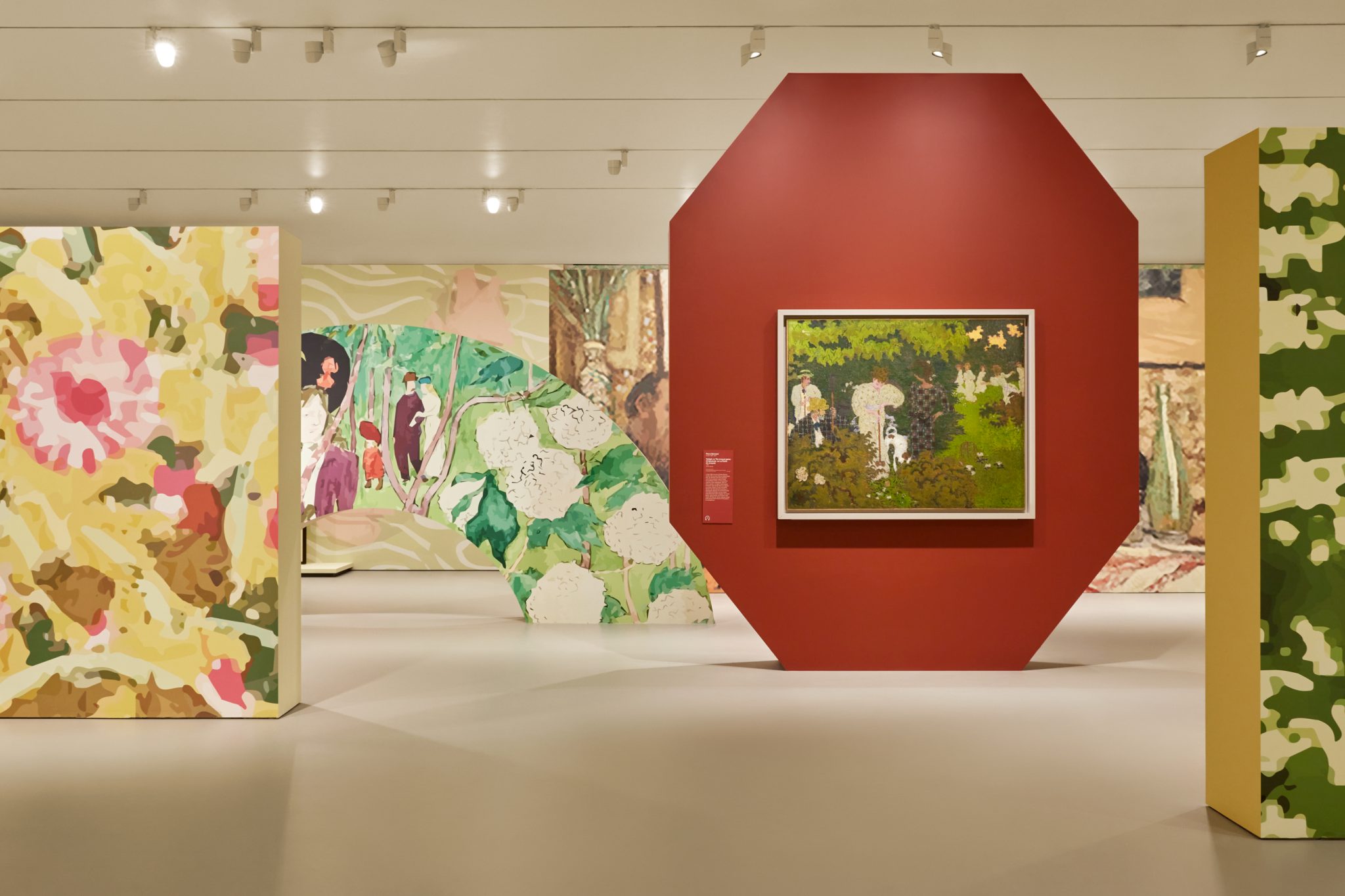
‘Painting must above all be decorative,’ opined the Post-Impressionist French painter and prominent member of the artist group Les Nabis, Pierre Bonnard in an 1891 issue of L’Écho de Paris. That belief goes some way towards explaining why the decision was made to commission the contemporary Paris-based architect and designer India Mahdavi (who’s known for creating plush, colourful interiors of spaces like London’s restaurant Sketch and the hotel Villa Medici in Rome) to create the scenography for the artist’s exhibition. What’s interesting is that it’s the first of National Gallery of Victoria’s annual ‘Melbourne Winter Masterpieces’ programme to place as significant an emphasis on the designer of its exhibition as on the actual artist themself. Mahdavi’s contributions include explosive wallpapered backdrops (the patterns of which are ‘sampled’ from Bonnard’s paintings), as well as slightly more pared-back block-colour painted walls (which complement the artist’s palette), as well as items of furniture (stools, chairs, tables, rugs, sofas), which are dotted throughout the four main gallery spaces.

The first thought that occurs is: did the curators of this exhibition worry that no one would visit unless they felt enticed by bright wallpaper and Insta-friendly backgrounds? But perhaps that’s too cynical a question. We won’t ever know the answer, anyway. The second question is: do Bonnard’s works really need to be pepped up by what looks like a stage set? Perhaps. There are a lot of works on show (more than 100). And the pops of colour that spread throughout the rooms do help to break up the weight of the vast exhibition (split into 16 sections). I have to confess at this point that I’m not a particular fan of Bonnard’s paintings. Especially paintings in which other people’s faces are involved. The ghastly children’s faces in In a Boat (1907), for example; and the many, many portraits of his wife and muse, Marthe de Méligny, on show here, whose face is often reduced to looking like a peach that’s been sat upon (Man and Woman, 1900). (Bonnard’s friend, Édouard Vuillard, some of whose paintings are shown in the section tiled ‘Les Nabis’, painted her better in Madame Bonnard and a dog, 1907.) Before anyone screams philistine at me, I’ll argue that Bonnard knew it too. Seeing as by around 1919’s Pink Nude, Head in Shadow, he seemed to have given up trying to paint faces properly anyway. So yeah, having something like an attractive long blue-and-yellow Mahdavi rug (on which several plush pink armchairs sit) does help to divert the eye. (I should mention that while Bonnard’s painted faces are abominable, he was pretty good at photographing his family and friends; there’s a pleasantly surprising series of black-and-white photographs shot in a garden, which includes the photo La Baignade: Vivette in the foreground, Robert in the background and two other children, 1903–05/2023, that captures a scene of children splashing in a river that manages to convey the essence of pure joy.)
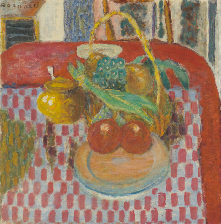
Where Bonnard does excel at painting is in still lifes and landscapes. His ability to evoke light, warmth and natural elements through colour is quite astonishing and – it sounds trite – you really do have to see it in person. Banks of the Seine (c. 1918) depicts a twilit river flowing in front of a dusky forest and foregrounded by bright bullrushes; it’s all passionate purply-blues and deep romantic greens. Then there’s The checkered tablecloth (1939), a still life of a basket of fruit and what looks like a pot of honey, in front of which is a plate with two round red fruits placed close together; it’s hard to tell what those fruits are, and to be honest I become distracted by the idea that they’ve started to look like a bottom spanked raw. The trouble with hanging paintings of such robust colour against wallpapers of pixelated flowers is that the effect of them is slightly dulled.

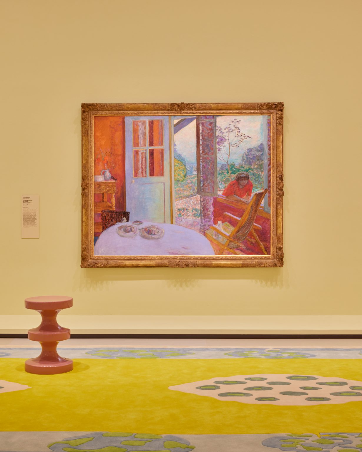
Most of my annoyance with this, however, is tempered by the quite wholesome scenes of visiting families with small children in the galleries who are busy trying to identify from which paintings the sampled patterns are sourced. Stopping to watch other visitors using Mahdavi’s furniture – kids crammed onto a long golden yellow sofa, elderly folk taking a pause on the upholstered chairs – offers a different perspective on why making a fuss over scenography might matter with huge survey exhibitions like this. The space, which felt like a weirdly stretched out facsimile of a domestic interior during the press walkthrough, feels lived in during public opening hours. The space is warm and comfortable to spend time in, inviting a meandering back-and-forth pace, which complements the best of Bonnard’s still lifes and paintings of domestic spaces. I return to Dining room overlooking the garden (1930–31), a painting of a table in front of a wood-framed window that overlooks a purple and green garden; the blue-and-white tablecloth is covered with breakfast items – a pot of tea, a basket of bread, fruit and a paper box that might be hiding pastries or a tart. It all looks idyllic. If you can ignore Madame Bonnard lurking just inside the frame.
Pierre Bonnard: Designed by India Mahdavi at National Gallery of Victoria, Melbourne, through 8 October
